Wednesday, 15 December 2010

film poster review


the idea was to create 3 film posters that could be used in our film the idea i wanted to create was that it was a film poster that relates to the film and to keep the audience in suspense into what is going to happen i wan the people to guess might be going but what they don't know is that the colours represent what the will be like and tell the outcome without you realising it is there right in front of you and it is waiting to be seen i also added a tag line saying the "the game ain't over yet" so that gives the audience indication that there is a twist in the title so that again gets the viewer to look more at the film and want to find out what its like all three have the actors names so again the viewer can see if there someone they like and then that can also influence people to go and see the film if i had to pick which one i would use in the film then i would say the first one but has a first poster to get people to see what that could be about and then use the second as a more off an idea of what the film will be about so them two posters could work with the project and get people interested into seeing the film
Friday, 10 December 2010

taken film poster anaylis

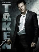
the poster shows just one character in the poster and that is Liam Nesson and in the poster he is the only name written in the poster no director, no company's. Liam Nesson is not a very well known actor so you can tell that the film maybe not over the top Hollywood film but maybe a very powerful story line which could get people interested in the film the poster shows Liam holding a gun and looking concerned which you can see that he is looking for someone. the design of the film is bright and dark to show that the actor is looking and the dark is where he is heading towards so it shows that it starts of well but then it heads in the wrong way into a action thriller with life on the risk. the colours to show the intense of the film but maybe the light colours can show relief in the end. the colours show that there are two different types of story's going on at the same time but leads into a action sequence that can be very dramatic and explosions. the film title is shown next to the actor and almost blends into the wall so that can show that the title is almost like the person who he is searching for in the film it stands out well and you can see that the bright colours are there to attract people to go and see the film the text is very easy to read as there is only to parts you are looking at the film name and the actor name they very well shown and shown in bright colours the font type shows how the film is like to the audience. again the film does not have a release date this is to keep the audience and fans to wait and then to get more people wanting to see the film. i chose this film poster because it shows that someone has been taken and they themselves have no idea of where they are and who put them there.

marathon man film poster anaylis

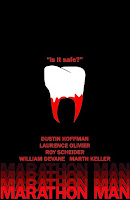
the poster has the tag line "is it safe?" showing that this is a horror film the tag line gets the stress, excitement and adrenaline up to say is safe but where that's what's get people interested in the film the tooth shows that body parts are being pulled out so this is showing that the film is for fans who like a scare or into gory films the tooth represents of how the film will be like it can show that something may be pulled apart again this draws people in to watch this film. The design of the poster is very basic it just shows a tooth just been pulled out it has the tag line above to show the people what type of film this it also has the list of the actors all the big names of the film are used Dustin Hoffman, Roy Schneider, Lawrence Oliver so again this can get more people to watch the film if they are a big fan of the actors. The Marathon Man is also shown like its blurred to maybe show that the person as been knocked out. The background is black again this is showing that it is a dark room and something is waiting to come out and surprise you. the colours have been chosen to show how intense the film will be to the people it sends out the horror into the peoples minds. the film doesn't show when the film will be released the film directors will keep the people to wait to get more people talking about the film and then when its released it will sell out quickly. the studio wants to bring the suspense into the people to keep them guessing of what might happen. I chose this film poster because it has the psycho we are using in our film and it also shows how intense the film will be for the viewers to watch and see how the film pans out.

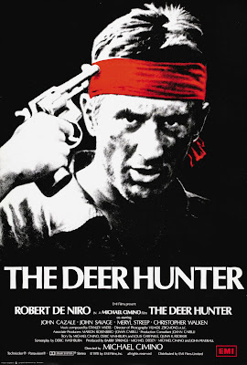
analysing the deer hunter film poster


the last poster shows Robert De Niro holding a gun to his head at the time De Niro was one of the most famous film stars so with his face on the poster it would be a big guarantee that it would very popular with most people. under the name of the film The Deer Hunter you can see out of all the people names listed on the poster Robert De Niro names is all the biggest even bigger than the director all the other actors are the same as most of the lesser people involved with the film so the idea of this film was to get people if robert De Niro was the main person on the film poster. the design of the poster is just De Niro but it shows him holding a gun to his face this is the part of the most well known part of the film the background of the film is black so is telling you that it would be a grim film when really its a war film. the colour had been chosen because its showing the intense of how serious it is when you play Russian Roulette. the title is very clear to read but most people would not understand that the picture shows a grim moment in the film when name doesn't seem such a bad name for film that gets very intense the text is very easy to read you can see the name of the film and Robert De Niro but every else would be very hard to see from a long distance which would be quite hard to read. the font is very basic but it stands out to the people to see the white colour makes it stand out very well to anyone who would see this the film does not include the date so the film producers wanted to get people exited about this film. i chose this film poster because are film is basically based around this we are doing Russian Roulette and this was the idea we got it from and it is a big influence on us.

Tuesday, 7 December 2010

storyboard shot list


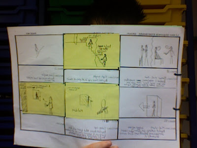
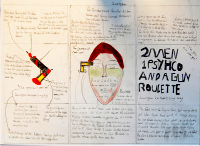
the storyboard is showing the beginning of the sequence the storyboard it has the picture showing what the main event of the story with the the shot number and shot type of the film the beginning of the film starts with two men sitting on a table being held by a psychopath who makes them play Russian roulette the first character is reassuring that there is no bullet in the gun but there is and the man is shot dead using the distraction of the second agent dying the first agent makes a run for it in the Psycho lair

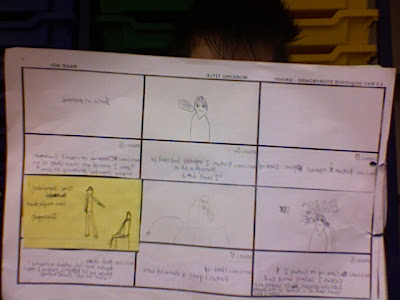
the second page of the storyboard is still with the agent just about to shoot himself. the first agent makes a run for the exit and hot on his trail is the psychopath who is willing to kill him the story continues with the agent trying to hide from the psycho and also looking for the exit to his freedom he looks around but with the panic that he could be killed he tries to get the psycho to lose his trail and possibly go somewhere that wont block the exit the story continues into the next side of the storyboard. the shot types will all be close up of the characters so you can see there facial expressions there also be point of view shoots so you can see what they can see so if you can see the other person view.


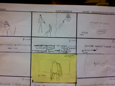
in the third sequence the agent has been captured and been sat down on the chair as the psycho pulls out his gun the agent ends up kicking the gun out of his hand and fights him for the gun the shot types will all be close ups to show the strain of both characters trying to get the gun as the storyboard ends the agent wins the battle of the gun and turns and shoots the psycho and makes a run for the exit but the psycho man is now on his trail trying to shoot him to death.
ends up with the agent making it to freedom the idea is that the guard continues to shot him but he gives up as he realises that he doesnt have to work for the psycho anymore and gives up but the agent ends up shooting him all the shot types are mostly long shots and close ups to show the faces and both characters.

Wednesday, 1 December 2010

action thriller mood board


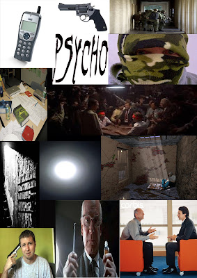
this is my action thriller mood board the idea of this is what the film is about but showing it with pictures to show what part of the film it represents for the example the picture of the man holding the gun to his head is for when the two men are forced to play Russian roulette. the picture next to him the man with the syringe and jar is to show the psycho in the film who holds the two men captured and forces them to play Russian Roulette with each other thats were the gun comes in. the man whose face is covered is the second man who is with the psycho he is there the main picture in the middle which is from the Deer Hunter the main source for film

the idea of the film is that two people are captured by a psychopath and are forced to play russian roulette with each other and then one of the characters makes sure that there inst a chamber in the gun but there was and the man dies using this time he escapes and hides around the chamber but the psycho is looking for him